Primary logo
Our logo is our first impression. Its symbol, a dotted hexagone, embodies "C Minds" and the wordmark complements this symbol with its neutral and organic look.
The logo is a brand's primary identifier. It contains both the symbol and our name in wordmark form. It should be used most often to represent our brand, especially to audiences unfamiliar with it.
Our logo is our first impression. Its symbol, a dotted hexagone, embodies "C Minds" and the wordmark complements this symbol with its neutral and organic look.
The hexagon is one of nature's most efficient and resilient structures, appearing across living systems from honeycombs to cellular networks. For C Minds, it symbolizes the power of interconnectedness, collaboration, and systems thinking—core principles that have guided our work for over two decades. Its evolution reflects our continued commitment to building bridges across sectors, disciplines, and knowledge systems to help shape more equitable and bioprosperous futures.

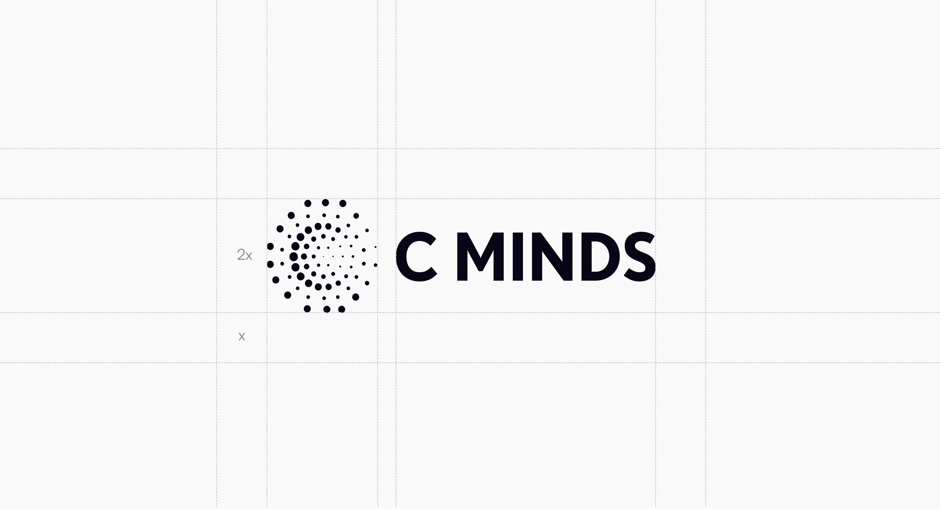
Be sure not to crowd the logo. When placing elements nearby, use the letter "C" in the wordmark as a guide for spacing.
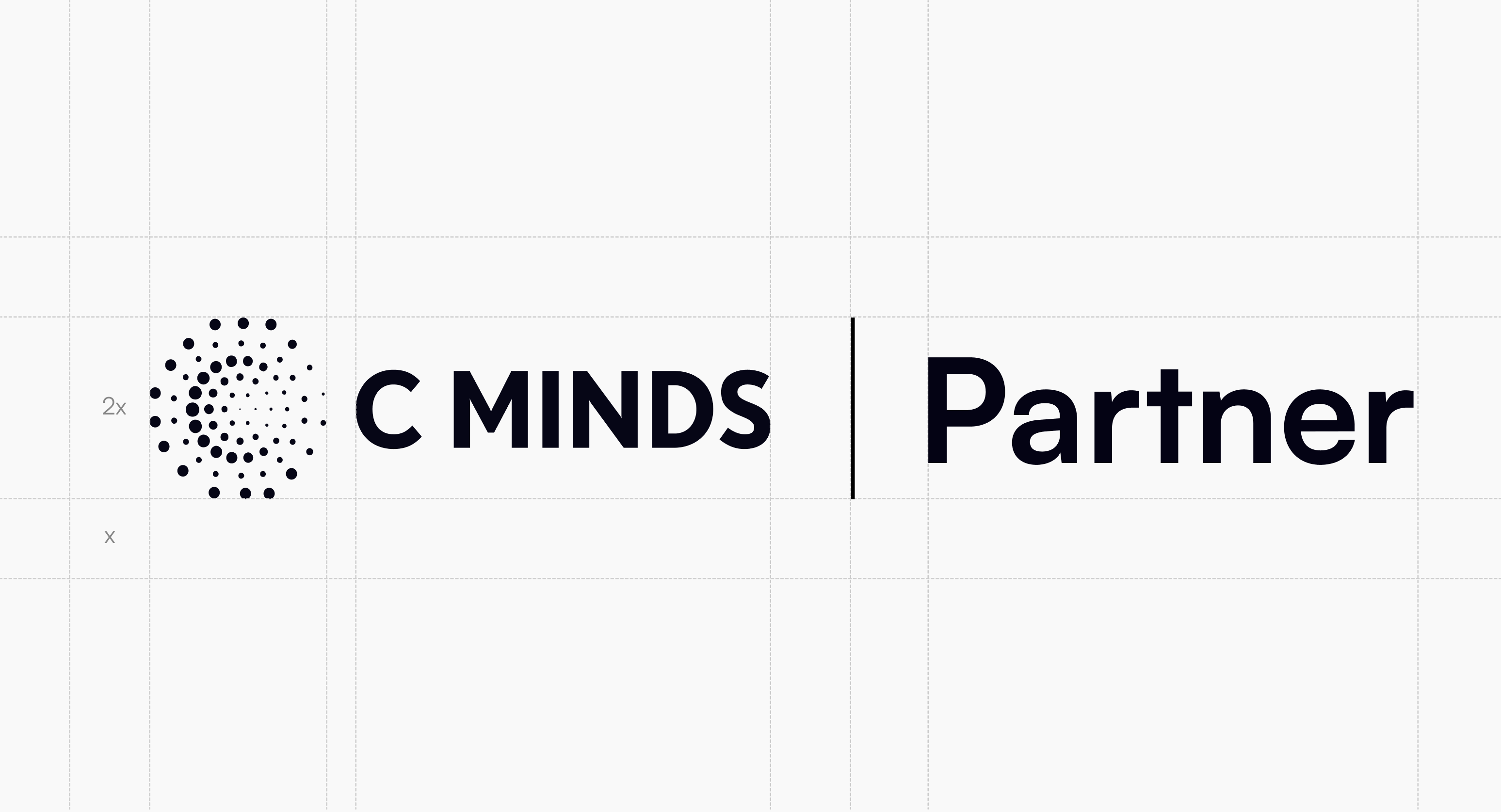
When positioning dual logos in brand partnerships, apply the same clearspace principles. Use a 1.5 px line that extends from the top to the bottom of the symbol's height as a divider between the two logos.
Our logo should only appear in black, white, or C Minds Blue 600 from the core palette. When placing the logo over imagery, ensure there is enough contrast to maintain clear legibility.
Monochrome versions can be used in the following cases:


Do not alter the logo. Avoid the following treatments.

Do not use the old logo

Do not stretch/squeeze the hexagone
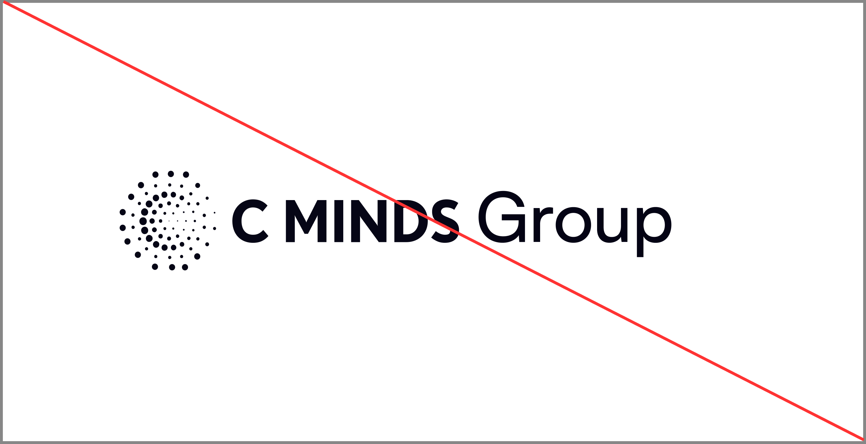
Do not create custom logos
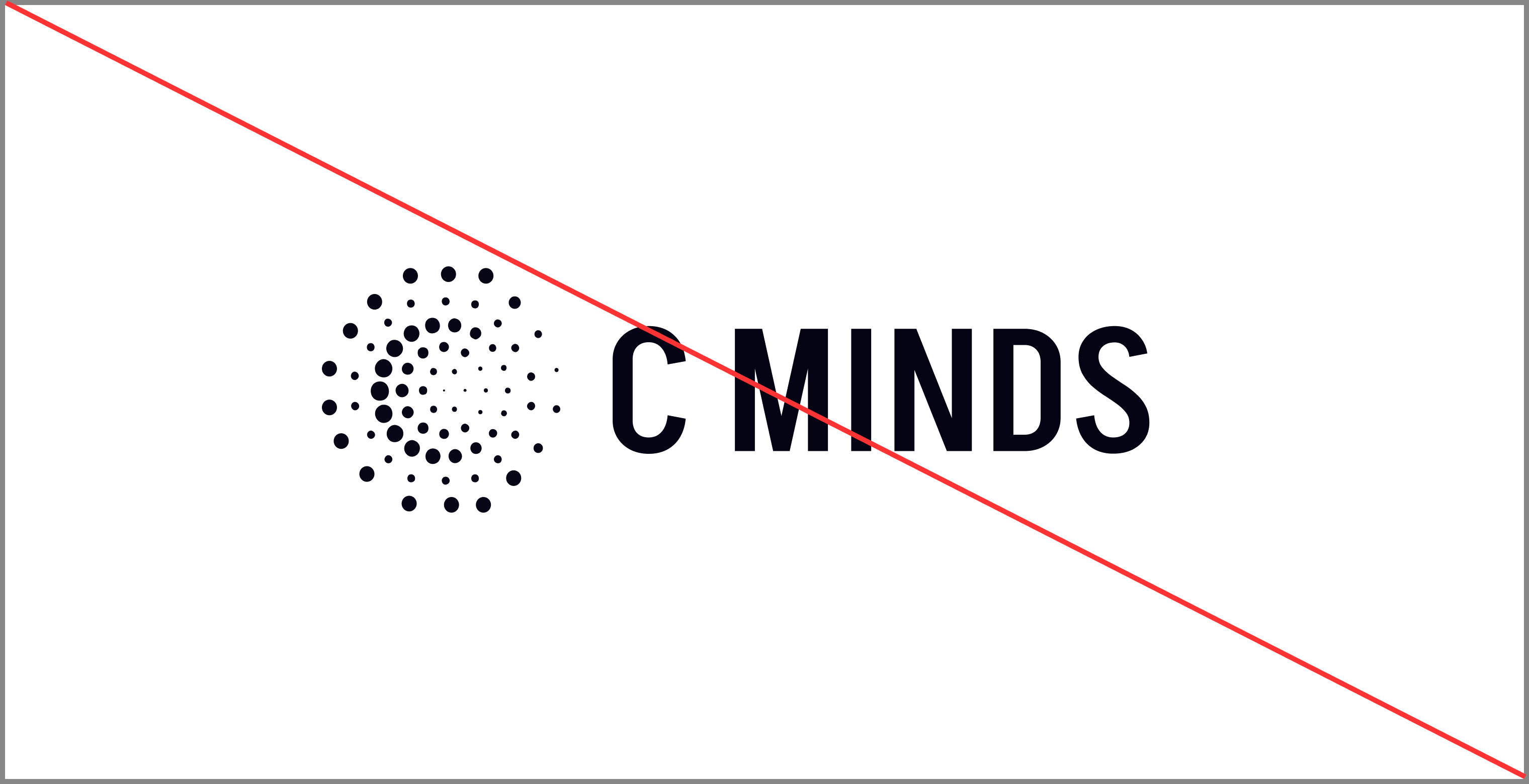
Do not alter the logo type
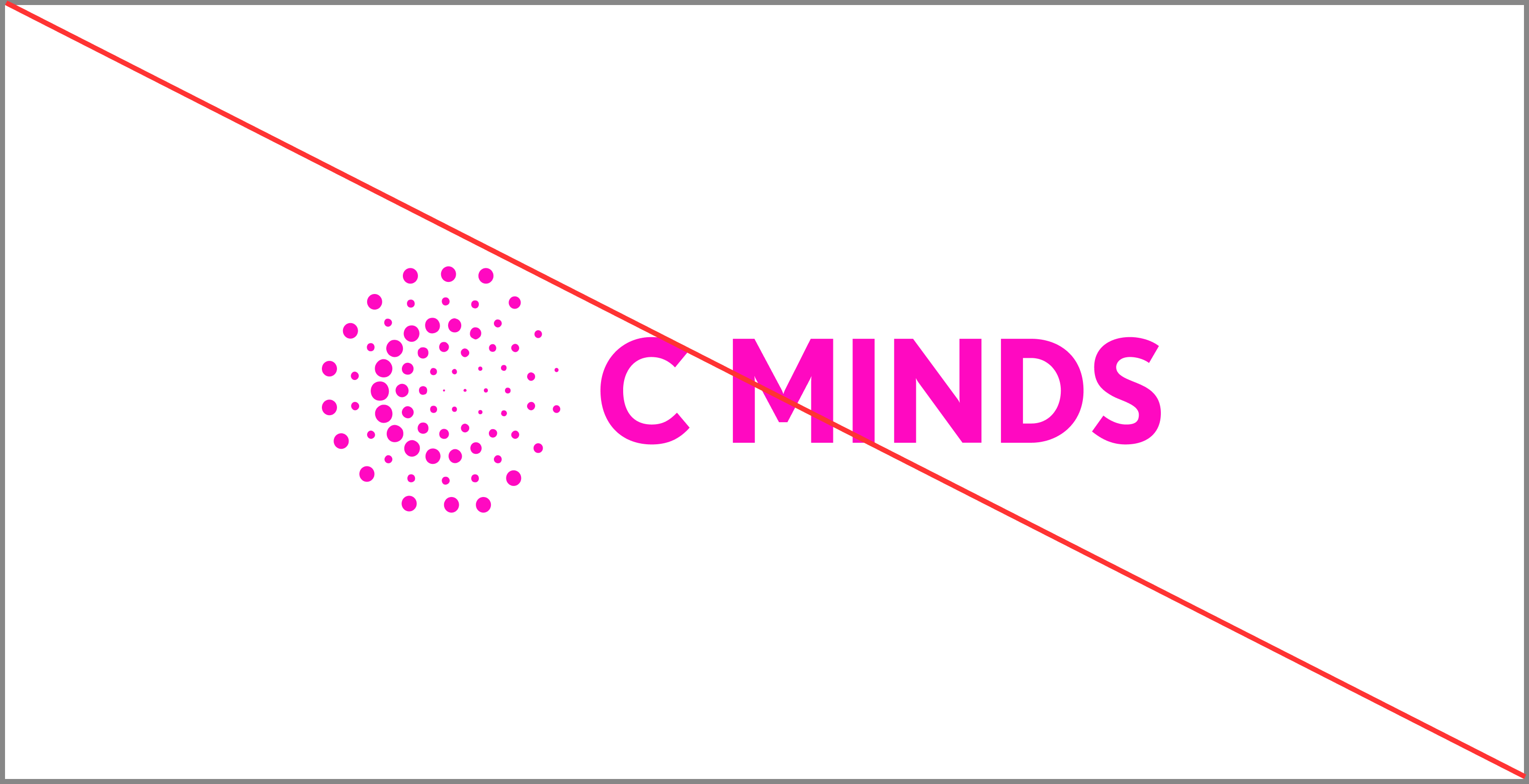
Do not apply multiple colors to the logo
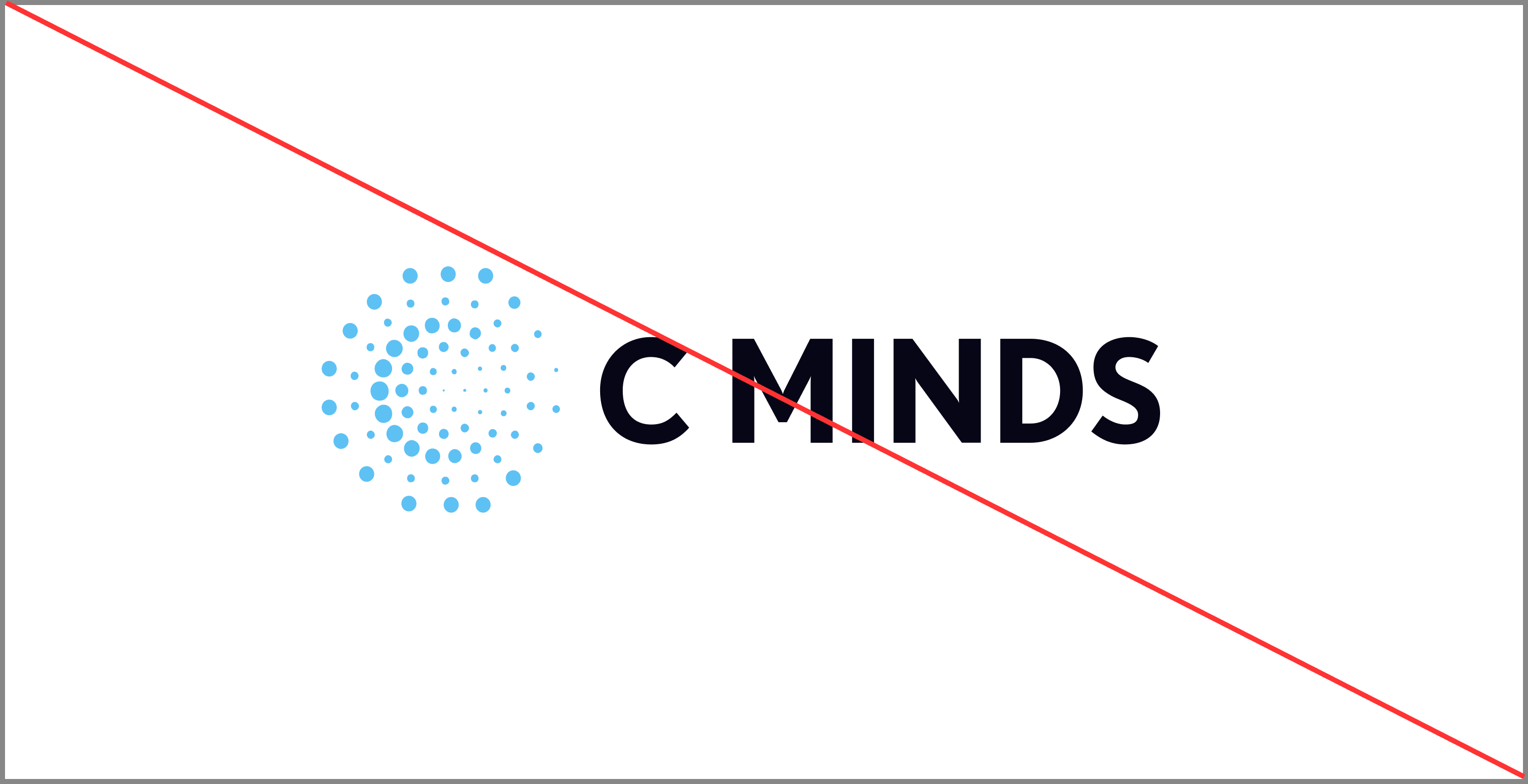
Do not use unapproved colors